# JavaScript Packages
# SweetAlert-2
sweetalert2.github.io (opens new window)
# DOWNLOAD & INSTALL
npm install sweetalert2
# Or grab from jsdelivr CDN (opens new window)
<script src="//cdn.jsdelivr.net/npm/sweetalert2@11"></script>
sweetalert2 is the 17th most popular package on jsDelivr, with 1,072,457,014 CDN hits in the last month
# USAGE
# 1. Initialize the plugin by referencing the necessary files:
<script src="sweetalert2.all.min.js"></script>
You can also include the stylesheet separately if desired:
<script src="sweetalert2.min.js"></script>
<link rel="stylesheet" href="sweetalert2.min.css">
2
Or
// ES6 Modules or TypeScript
import Swal from 'sweetalert2'

// CommonJS
const Swal = require('sweetalert2')
2
3
4
5
It's possible to import JS and CSS separately, e.g. if you need to customize styles:
import Swal from 'sweetalert2/dist/sweetalert2.js'

import 'sweetalert2/src/sweetalert2.scss'
2
3
# 2. Call the sweetAlert2-function after the page has loaded
Swal.fire({
  title: 'Error!',
  text: 'Do you want to continue',
  icon: 'error',
  confirmButtonText: 'Cool'
})
2
3
4
5
6
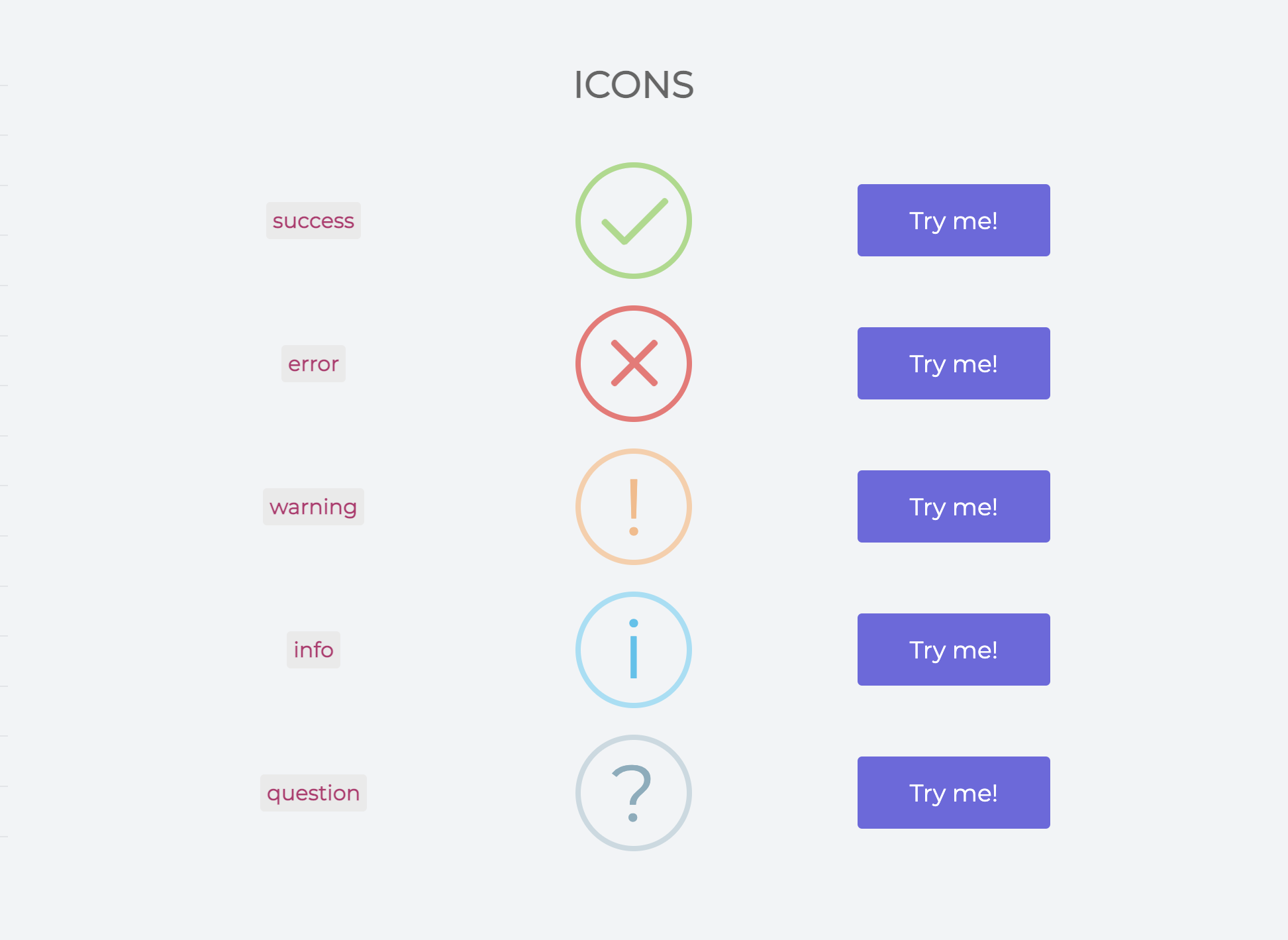
# Icons
# Examples In This Project
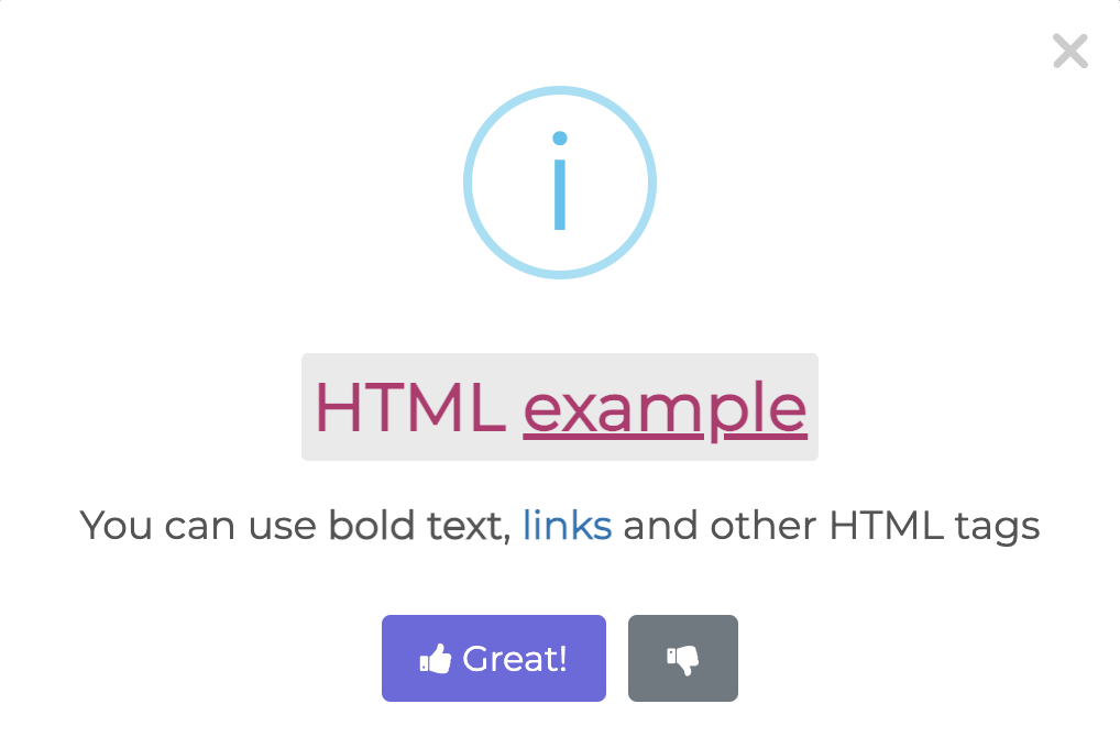
# Custom HTML description and buttons with ARIA labels
Swal.fire({
  title: '<strong>HTML <u>example</u></strong>',
  icon: 'info',
  html:
    'You can use <b>bold text</b>, ' +
    '<a href="//sweetalert2.github.io">links</a> ' +
    'and other HTML tags',
  showCloseButton: true,
  showCancelButton: true,
  focusConfirm: false,
  confirmButtonText:
    '<i class="fa fa-thumbs-up"></i> Great!',
  confirmButtonAriaLabel: 'Thumbs up, great!',
  cancelButtonText:
    '<i class="fa fa-thumbs-down"></i>',
  cancelButtonAriaLabel: 'Thumbs down'
})
2
3
4
5
6
7
8
9
10
11
12
13
14
15
16
17
# Demo
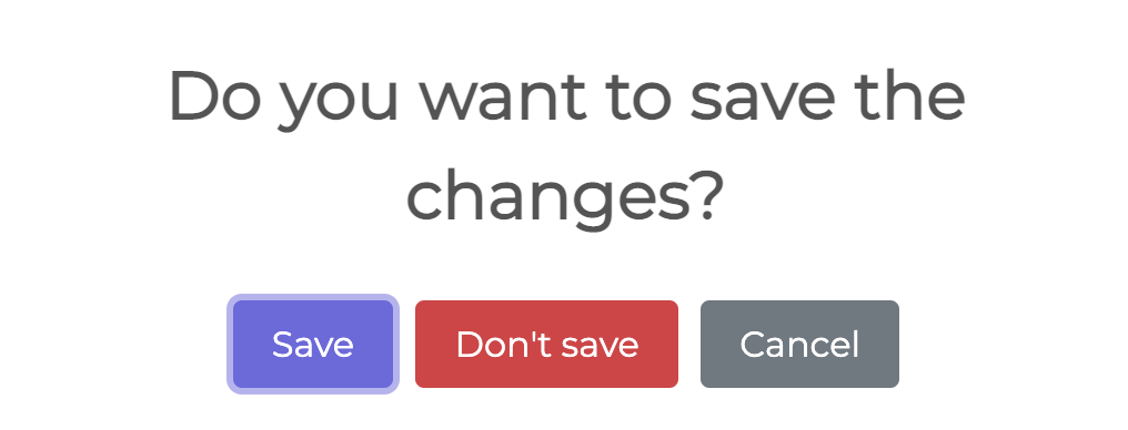
# A dialog with three buttons
Swal.fire({
  title: 'Do you want to save the changes?',
  showDenyButton: true,
  showCancelButton: true,
  confirmButtonText: 'Save',
  denyButtonText: `Don't save`,
}).then((result) => {
  /* Read more about isConfirmed, isDenied below */
  if (result.isConfirmed) {
    Swal.fire('Saved!', '', 'success')
  } else if (result.isDenied) {
    Swal.fire('Changes are not saved', '', 'info')
  }
})
2
3
4
5
6
7
8
9
10
11
12
13
14
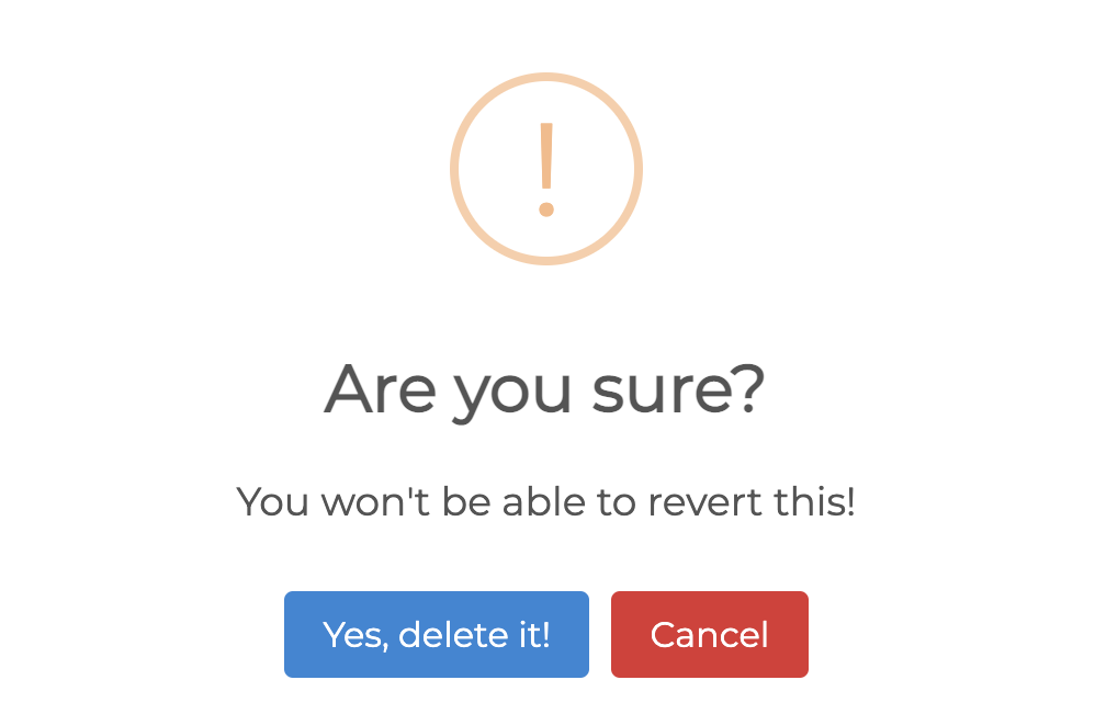
# Demo
# A confirm dialog, with a function attached to the "Confirm"-button
Swal.fire({
  title: 'Are you sure?',
  text: "You won't be able to revert this!",
  icon: 'warning',
  showCancelButton: true,
  confirmButtonColor: '#3085d6',
  cancelButtonColor: '#d33',
  confirmButtonText: 'Yes, delete it!'
}).then((result) => {
  if (result.isConfirmed) {
    Swal.fire(
      'Deleted!',
      'Your file has been deleted.',
      'success'
    )
  }
})
2
3
4
5
6
7
8
9
10
11
12
13
14
15
16
17
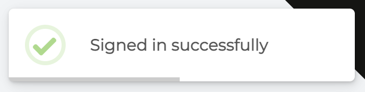
# Demo
# Toast Example
const Toast = Swal.mixin({
  toast: true,
  position: 'top-end',
  showConfirmButton: false,
  timer: 3000,
  timerProgressBar: true,
  didOpen: (toast) => {
    toast.addEventListener('mouseenter', Swal.stopTimer)
    toast.addEventListener('mouseleave', Swal.resumeTimer)
  }
})

Toast.fire({
  icon: 'success',
  title: 'Signed in successfully'
})
2
3
4
5
6
7
8
9
10
11
12
13
14
15
16
# Demo
# Select-2
select2.org (opens new window)
# Using Select2 from a CDN
A CDN (content delivery network) is the fastest way to get up and running with Select2! Select2 is hosted on both the jsDelivr (opens new window) and cdnjs CDNs (opens new window).
Simply include the following lines of code in the <head> section of your page:
<link href="https://cdn.jsdelivr.net/npm/select2@4.1.0-rc.0/dist/css/select2.min.css" rel="stylesheet" />
<script src="https://cdn.jsdelivr.net/npm/select2@4.1.0-rc.0/dist/js/select2.min.js"></script>
2
# Installing with Bower
# Select2 is available on Bower. Add the following to your bower.json file and then run bower install:
"dependencies": {
    "select2": "~4.0"
}
2
3
# Or, run bower install select2 from your project directory.
The precompiled distribution files will be available in vendor/select2/dist/css/ and vendor/select2/dist/js/, relative to your project directory. Include them in your page:
<link href="vendor/select2/dist/css/select2.min.css" rel="stylesheet" />
<script src="vendor/select2/dist/js/select2.min.js"></script>
2
# Single select boxes
 Select2 was designed to be a replacement for the standard
 <select> box that is displayed by the browser.
By default it supports all options and operations that are available in a standard select box, but with added flexibility.
<select class="js-example-basic-single" name="state">
  <option value="AL">Alabama</option>
    ...
  <option value="WY">Wyoming</option>
</select>
2
3
4
5
Select2 will register itself as a jQuery function if you use any of the distribution builds, so you can call .select2() on any jQuery selector where you would like to initialize Select2.
// In your Javascript (external .js resource or <script> tag)
$(document).ready(function() {
    $('.js-example-basic-single').select2();
});
2
3
4
# Multi-select boxes (pillbox)
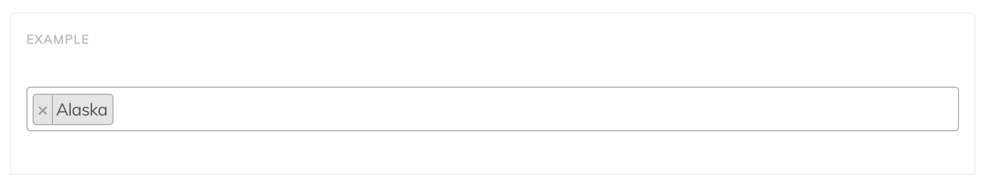
Select2 also supports multi-value select boxes. The select below is declared with the multiple attribute.
<select class="js-example-basic-multiple" name="states[]" multiple="multiple">
  <option value="AL">Alabama</option>
    ...
  <option value="WY">Wyoming</option>
</select>
2
3
4
5
In your Javascript (external .js resource or <script> tag):
$(document).ready(function() {
    $('.js-example-basic-multiple').select2();
});
2
3
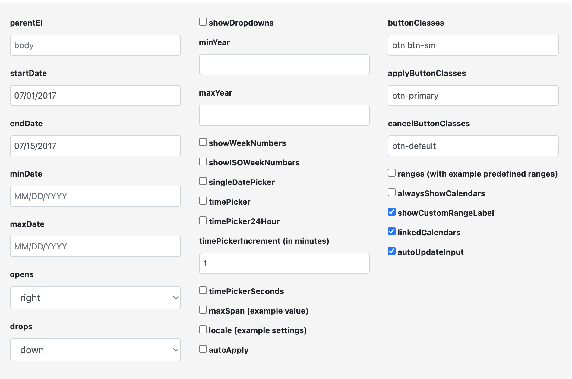
# DateRangePicker
daterangepicker.com (opens new window)
# Getting Started
To get started, include jQuery, Moment.js and Date Range Picker's files in your webpage:
<script type="text/javascript" src="https://cdn.jsdelivr.net/jquery/latest/jquery.min.js"></script>
<script type="text/javascript" src="https://cdn.jsdelivr.net/momentjs/latest/moment.min.js"></script>
<script type="text/javascript" src="https://cdn.jsdelivr.net/npm/daterangepicker/daterangepicker.min.js"></script>
<link rel="stylesheet" type="text/css" href="https://cdn.jsdelivr.net/npm/daterangepicker/daterangepicker.css" />
2
3
4
Then attach a date range picker to whatever you want to trigger it:
$('input[name="dates"]').daterangepicker();
# Examples
# Simple Date Range Picker With a Callback
<input type="text" name="daterange" value="01/01/2018 - 01/15/2018" />

<script>
$(function() {
  $('input[name="daterange"]').daterangepicker({
    opens: 'left'
  }, function(start, end, label) {
    console.log("A new date selection was made: " + start.format('YYYY-MM-DD') + ' to ' + end.format('YYYY-MM-DD'));
  });
});
</script>
2
3
4
5
6
7
8
9
10
11
# Date Range Picker With Times
<input type="text" name="datetimes" />

<script>
$(function() {
  $('input[name="datetimes"]').daterangepicker({
    timePicker: true,
    startDate: moment().startOf('hour'),
    endDate: moment().startOf('hour').add(32, 'hour'),
    locale: {
      format: 'M/DD hh:mm A'
    }
  });
});
</script>
2
3
4
5
6
7
8
9
10
11
12
13
14
# Single Date Picker
<input type="text" name="birthday" value="10/24/1984" />

<script>
$(function() {
  $('input[name="birthday"]').daterangepicker({
    singleDatePicker: true,
    showDropdowns: true,
    minYear: 1901,
    maxYear: parseInt(moment().format('YYYY'),10)
  }, function(start, end, label) {
    var years = moment().diff(start, 'years');
    alert("You are " + years + " years old!");
  });
});
</script>
2
3
4
5
6
7
8
9
10
11
12
13
14
15
# Predefined Date Ranges
<div id="reportrange" style="background: #fff; cursor: pointer; padding: 5px 10px; border: 1px solid #ccc; width: 100%">
<i class="fa fa-calendar"></i>
<span></span> <i class="fa fa-caret-down"></i>
</div>
<script type="text/javascript">
$(function() {
var start = moment().subtract(29, 'days');
var end = moment();
function cb(start, end) {
$('#reportrange span').html(start.format('MMMM D, YYYY') + ' - ' + end.format('MMMM D, YYYY'));
}
$('#reportrange').daterangepicker({
startDate: start,
endDate: end,
ranges: {
'Today': [moment(), moment()],
'Yesterday': [moment().subtract(1, 'days'), moment().subtract(1, 'days')],
'Last 7 Days': [moment().subtract(6, 'days'), moment()],
'Last 30 Days': [moment().subtract(29, 'days'), moment()],
'This Month': [moment().startOf('month'), moment().endOf('month')],
'Last Month': [moment().subtract(1, 'month').startOf('month'), moment().subtract(1, 'month').endOf('month')]
}
}, cb);
cb(start, end);
});
</script>
2
3
4
5
6
7
8
9
10
11
12
13
14
15
16
17
18
19
20
21
22
23
24
25
26
27
28
29
30
31
32
# Input Initially Empty
<input type="text" name="datefilter" value="" />

<script type="text/javascript">
$(function() {

  $('input[name="datefilter"]').daterangepicker({
      autoUpdateInput: false,
      locale: {
          cancelLabel: 'Clear'
      }
  });

  $('input[name="datefilter"]').on('apply.daterangepicker', function(ev, picker) {
      $(this).val(picker.startDate.format('MM/DD/YYYY') + ' - ' + picker.endDate.format('MM/DD/YYYY'));
  });

  $('input[name="datefilter"]').on('cancel.daterangepicker', function(ev, picker) {
      $(this).val('');
  });

});
</script>
2
3
4
5
6
7
8
9
10
11
12
13
14
15
16
17
18
19
20
21
22
# Example usage:
//create a new date range picker
$('#daterange').daterangepicker({ startDate: '03/05/2005', endDate: '03/06/2005' });

//change the selected date range of that picker
$('#daterange').data('daterangepicker').setStartDate('03/01/2014');
$('#daterange').data('daterangepicker').setEndDate('03/31/2014');
2
3
4
5
6
# Configuration Generator (opens new window)
# Sortable
sortablejs.github.io (opens new window)
# Getting Started
Install with NPM:
npm install sortablejs --save
Install with Bower:
bower install --save sortablejs
CDN
<!-- jsDelivr :: Sortable :: Latest (https://www.jsdelivr.com/package/npm/sortablejs) -->
<script src="https://cdn.jsdelivr.net/npm/sortablejs@latest/Sortable.min.js"></script>
2
Import into your project:
// Default SortableJS
import Sortable from 'sortablejs';

// Core SortableJS (without default plugins)
import Sortable from 'sortablejs/modular/sortable.core.esm.js';

// Complete SortableJS (with all plugins)
import Sortable from 'sortablejs/modular/sortable.complete.esm.js';
2
3
4
5
6
7
8
Cherrypick plugins:
// Cherrypick extra plugins
import Sortable, { MultiDrag, Swap } from 'sortablejs';

Sortable.mount(new MultiDrag(), new Swap());


// Cherrypick default plugins
import Sortable, { AutoScroll } from 'sortablejs/modular/sortable.core.esm.js';

Sortable.mount(new AutoScroll());
2
3
4
5
6
7
8
9
10
# Usage
<ul id="items">
	<li>item 1</li>
	<li>item 2</li>
	<li>item 3</li>
</ul>
2
3
4
5
var el = document.getElementById('items');
var sortable = Sortable.create(el);
2
You can use any element for the list and its elements, not just ul/li.
Here is an example with divs (opens new window).
# Options
var sortable = new Sortable(el, {
	group: "name",  // or { name: "...", pull: [true, false, 'clone', array], put: [true, false, array] }
	sort: true,  // sorting inside list
	delay: 0, // time in milliseconds to define when the sorting should start
	delayOnTouchOnly: false, // only delay if user is using touch
	touchStartThreshold: 0, // px, how many pixels the point should move before cancelling a delayed drag event
	disabled: false, // Disables the sortable if set to true.
	store: null,  // @see Store
	animation: 150,  // ms, animation speed moving items when sorting, `0` — without animation
	easing: "cubic-bezier(1, 0, 0, 1)", // Easing for animation. Defaults to null. See https://easings.net/ for examples.
	handle: ".my-handle",  // Drag handle selector within list items
	filter: ".ignore-elements",  // Selectors that do not lead to dragging (String or Function)
	preventOnFilter: true, // Call `event.preventDefault()` when triggered `filter`
	draggable: ".item",  // Specifies which items inside the element should be draggable

	dataIdAttr: 'data-id', // HTML attribute that is used by the `toArray()` method

	ghostClass: "sortable-ghost",  // Class name for the drop placeholder
	chosenClass: "sortable-chosen",  // Class name for the chosen item
	dragClass: "sortable-drag",  // Class name for the dragging item

	swapThreshold: 1, // Threshold of the swap zone
	invertSwap: false, // Will always use inverted swap zone if set to true
	invertedSwapThreshold: 1, // Threshold of the inverted swap zone (will be set to swapThreshold value by default)
	direction: 'horizontal', // Direction of Sortable (will be detected automatically if not given)

	forceFallback: false,  // ignore the HTML5 DnD behaviour and force the fallback to kick in

	fallbackClass: "sortable-fallback",  // Class name for the cloned DOM Element when using forceFallback
	fallbackOnBody: false,  // Appends the cloned DOM Element into the Document's Body
	fallbackTolerance: 0, // Specify in pixels how far the mouse should move before it's considered as a drag.

	dragoverBubble: false,
	removeCloneOnHide: true, // Remove the clone element when it is not showing, rather than just hiding it
	emptyInsertThreshold: 5, // px, distance mouse must be from empty sortable to insert drag element into it


	setData: function (/** DataTransfer */dataTransfer, /** HTMLElement*/dragEl) {
		dataTransfer.setData('Text', dragEl.textContent); // `dataTransfer` object of HTML5 DragEvent
	},

	// Element is chosen
	onChoose: function (/**Event*/evt) {
		evt.oldIndex;  // element index within parent
	},

	// Element is unchosen
	onUnchoose: function(/**Event*/evt) {
		// same properties as onEnd
	},

	// Element dragging started
	onStart: function (/**Event*/evt) {
		evt.oldIndex;  // element index within parent
	},

	// Element dragging ended
	onEnd: function (/**Event*/evt) {
		var itemEl = evt.item;  // dragged HTMLElement
		evt.to;    // target list
		evt.from;  // previous list
		evt.oldIndex;  // element's old index within old parent
		evt.newIndex;  // element's new index within new parent
		evt.oldDraggableIndex; // element's old index within old parent, only counting draggable elements
		evt.newDraggableIndex; // element's new index within new parent, only counting draggable elements
		evt.clone // the clone element
		evt.pullMode;  // when item is in another sortable: `"clone"` if cloning, `true` if moving
	},

	// Element is dropped into the list from another list
	onAdd: function (/**Event*/evt) {
		// same properties as onEnd
	},

	// Changed sorting within list
	onUpdate: function (/**Event*/evt) {
		// same properties as onEnd
	},

	// Called by any change to the list (add / update / remove)
	onSort: function (/**Event*/evt) {
		// same properties as onEnd
	},

	// Element is removed from the list into another list
	onRemove: function (/**Event*/evt) {
		// same properties as onEnd
	},

	// Attempt to drag a filtered element
	onFilter: function (/**Event*/evt) {
		var itemEl = evt.item;  // HTMLElement receiving the `mousedown|tapstart` event.
	},

	// Event when you move an item in the list or between lists
	onMove: function (/**Event*/evt, /**Event*/originalEvent) {
		// Example: https://jsbin.com/nawahef/edit?js,output
		evt.dragged; // dragged HTMLElement
		evt.draggedRect; // DOMRect {left, top, right, bottom}
		evt.related; // HTMLElement on which have guided
		evt.relatedRect; // DOMRect
		evt.willInsertAfter; // Boolean that is true if Sortable will insert drag element after target by default
		originalEvent.clientY; // mouse position
		// return false; — for cancel
		// return -1; — insert before target
		// return 1; — insert after target
		// return true; — keep default insertion point based on the direction
		// return void; — keep default insertion point based on the direction
	},

	// Called when creating a clone of element
	onClone: function (/**Event*/evt) {
		var origEl = evt.item;
		var cloneEl = evt.clone;
	},

	// Called when dragging element changes position
	onChange: function(/**Event*/evt) {
		evt.newIndex // most likely why this event is used is to get the dragging element's current index
		// same properties as onEnd
	}
});
2
3
4
5
6
7
8
9
10
11
12
13
14
15
16
17
18
19
20
21
22
23
24
25
26
27
28
29
30
31
32
33
34
35
36
37
38
39
40
41
42
43
44
45
46
47
48
49
50
51
52
53
54
55
56
57
58
59
60
61
62
63
64
65
66
67
68
69
70
71
72
73
74
75
76
77
78
79
80
81
82
83
84
85
86
87
88
89
90
91
92
93
94
95
96
97
98
99
100
101
102
103
104
105
106
107
108
109
110
111
112
113
114
115
116
117
118
119
120
121
122
# group option
To drag elements from one list into another,
both lists must have the same group value.
You can also define whether lists can give away,
give and keep a copy (clone), and receive elements.
- name:
String— group name - pull:
true|false|["foo", "bar"]|'clone'|function— ability to move from the list.clone— copy the item, rather than move. Or an array of group names which the elements may be put in. Defaults totrue. - put:
true|false|["baz", "qux"]|function— whether elements can be added from other lists, or an array of group names from which elements can be added. - revertClone:
boolean— revert cloned element to initial position after moving to a another list.
Demo:
- Demo (opens new window)
- Demo (opens new window)— use of complex logic in the
pullandput - Demo (opens new window)— use revertClone: true
# sort option Demo (opens new window)
Allow sorting inside list.
# delay option Demo (opens new window)
Time in milliseconds to define when the sorting should start. Unfortunately, due to browser restrictions, delaying is not possible on IE or Edge with native drag & drop.
# delayOnTouchOnly option
Whether or not the delay should be applied only
if the user is using touch (eg. on a mobile device).
No delay will be applied in any other case.
Defaults to false.
# swapThreshold option Demo (opens new window)
Percentage of the target that the swap zone will take up,
as a float between 0 and 1.
# invertSwap option Demo (opens new window)
Set to true to set the swap zone to the sides of the target, for the effect of sorting "in between" items.
# invertedSwapThreshold option
Percentage of the target that the inverted swap zone will take up, as a float between 0 and 1. If not given, will default to swapThreshold.
# direction option
Direction that the Sortable should sort in.
Can be set to 'vertical', 'horizontal', or a function,
which will be called whenever a target is dragged over.
Must return 'vertical' or 'horizontal'.
Example of direction detection for vertical list that includes full column and half column elements:
Sortable.create(el, {
	direction: function(evt, target, dragEl) {
		if (target !== null && target.className.includes('half-column') && dragEl.className.includes('half-column')) {
			return 'horizontal';
		}
		return 'vertical';
	}
});
2
3
4
5
6
7
8
# touchStartThreshold option
This option is similar to fallbackTolerance option.
When the delay option is set, some phones
with very sensitive touch displays like the Samsung
Galaxy S8 will fire unwanted touchmove events even
when your finger is not moving, resulting in the sort
not triggering.
This option sets the minimum pointer movement that must occur before the delayed sorting is cancelled.
Values between 3 to 5 are good.
# disabled options Demo (opens new window)
Disables the sortable if set to true.
var sortable = Sortable.create(list);

document.getElementById("switcher").onclick = function () {
	var state = sortable.option("disabled"); // get

	sortable.option("disabled", !state); // set
};
2
3
4
5
6
7
# handle option Demo (opens new window)
To make list items draggable, Sortable disables text selection by the user. That's not always desirable. To allow text selection, define a drag handler, which is an area of every list element that allows it to be dragged around.
Sortable.create(el, {
	handle: ".my-handle"
});
2
3
<ul>
	<li><span class="my-handle">::</span> list item text one
	<li><span class="my-handle">::</span> list item text two
</ul>
2
3
4
.my-handle {
	cursor: move;
	cursor: -webkit-grabbing;
}
2
3
4
# filter option
Sortable.create(list, {
	filter: ".js-remove, .js-edit",
	onFilter: function (evt) {
		var item = evt.item,
			ctrl = evt.target;

		if (Sortable.utils.is(ctrl, ".js-remove")) {  // Click on remove button
			item.parentNode.removeChild(item); // remove sortable item
		}
		else if (Sortable.utils.is(ctrl, ".js-edit")) {  // Click on edit link
			// ...
		}
	}
})
2
3
4
5
6
7
8
9
10
11
12
13
14
# ghostClass option Demo (opens new window)
Class name for the drop placeholder (default sortable-ghost).
.ghost {
  opacity: 0.4;
}
2
3
Sortable.create(list, {
  ghostClass: "ghost"
});
2
3
# chosenClass option Demo (opens new window)
Class name for the chosen item (default sortable-chosen).
.chosen {
  color: #fff;
  background-color: #c00;
}
2
3
4
Sortable.create(list, {
  delay: 500,
  chosenClass: "chosen"
});
2
3
4
# forceFallback option Demo (opens new window)
If set to true, the Fallback for non HTML5 Browser will be used, even if we are using an HTML5 Browser. This gives us the possibility to test the behaviour for older Browsers even in newer Browser, or make the Drag 'n Drop feel more consistent between Desktop , Mobile and old Browsers.
On top of that, the Fallback always generates
a copy of that DOM Element and appends the class
fallbackClass defined in the options. This behaviour controls the look of this 'dragged' Element.
# fallbackTolerance option
Emulates the native drag threshold. Specify in pixels how far the mouse should move before it's considered as a drag. Useful if the items are also clickable like in a list of links.
When the user clicks inside a sortable element, it's not uncommon for your hand to move a little between the time you press and the time you release. Dragging only starts if you move the pointer past a certain tolerance, so that you don't accidentally start dragging every time you click.
3 to 5 are probably good values.
# dragoverBubble option
If set to true, the dragover event will bubble to parent sortables. Works on both fallback and native dragover event. By default, it is false, but Sortable will only stop bubbling the event once the element has been inserted into a parent Sortable, or can be inserted into a parent Sortable, but isn't at that specific time (due to animation, etc).
Since 1.8.0, you will probably want to leave this option as false. Before 1.8.0, it may need to be true for nested sortables to work.
# removeCloneOnHide option
If set to false, the clone is hidden by having it's CSS display property set to none. By default, this option is true, meaning Sortable will remove the cloned element from the DOM when it is supposed to be hidden.
# emptyInsertThreshold option Demo (opens new window)
The distance (in pixels) the mouse must be from an empty sortable while dragging for the drag element to be inserted into that sortable. Defaults to 5. Set to 0 to disable this feature.
An alternative to this option would be to set a padding on your list when it is empty.
For example:
ul:empty {
  padding-bottom: 20px;
}
2
3
Warning: For :empty to work, it must have no node inside (even text one).
# Event object Demo (opens new window)
- to:
HTMLElement— list, in which moved element - from:
HTMLElement— previous list - item:
HTMLElement— dragged element - clone:
HTMLElement - oldIndex:
Number|undefined— old index within parent - newIndex:
Number|undefined— new index within parent - oldDraggableIndex:
Number|undefined— old index within parent, only counting draggable elements - newDraggableIndex:
Number|undefined— new index within parent, only counting draggable elements - pullMode:
String|Boolean|undefined— Pull mode if dragging into another sortable ("clone",true, orfalse), otherwise undefined
# move event object
- to:
HTMLElement - from:
HTMLElement - dragged:
HTMLElement - draggedRect:
DOMRect - related:
HTMLElement— element on which have guided - relatedRect:
DOMRect - willInsertAfter:
Boolean—trueif will element be inserted after target (orfalseif before)
# Methods
# option(name:String[, value:*]):*
Get or set the option.
closest(el:HTMLElement[, selector:String]):HTMLElement|null
For each element in the set, get the first element that matches the selector by testing the element itself and traversing up through its ancestors in the DOM tree.
toArray():String[]
Serializes the sortable's item data-id's (dataIdAttr option) into an array of string.
sort(order:String[], useAnimation:Boolean)
Sorts the elements according to the array.
var order = sortable.toArray();
sortable.sort(order.reverse(), true); // apply
2
save()
Save the current sorting (see on store)
destroy()
Removes the sortable functionality completely.
# Store
Saving and restoring of the sort.
<ul>
	<li data-id="1">order</li>
	<li data-id="2">save</li>
	<li data-id="3">restore</li>
</ul>
2
3
4
5
Sortable.create(el, {
	group: "localStorage-example",
	store: {
		/**
		 * Get the order of elements. Called once during initialization.
		 * @param   {Sortable}  sortable
		 * @returns {Array}
		 */
		get: function (sortable) {
			var order = localStorage.getItem(sortable.options.group.name);
			return order ? order.split('|') : [];
		},

		/**
		 * Save the order of elements. Called onEnd (when the item is dropped).
		 * @param {Sortable}  sortable
		 */
		set: function (sortable) {
			var order = sortable.toArray();
			localStorage.setItem(sortable.options.group.name, order.join('|'));
		}
	}
})
2
3
4
5
6
7
8
9
10
11
12
13
14
15
16
17
18
19
20
21
22
23
# Bootstrap Demo (opens new window)
<!-- Latest compiled and minified CSS -->
<link rel="stylesheet" href="https://maxcdn.bootstrapcdn.com/bootstrap/3.3.1/css/bootstrap.min.css"/>


<!-- Latest Sortable -->
<script src="http://SortableJS.github.io/Sortable/Sortable.js"></script>


<!-- Simple List -->
<ul id="simpleList" class="list-group">
	<li class="list-group-item">This is <a href="http://SortableJS.github.io/Sortable/">Sortable</a></li>
	<li class="list-group-item">It works with Bootstrap...</li>
	<li class="list-group-item">...out of the box.</li>
	<li class="list-group-item">It has support for touch devices.</li>
	<li class="list-group-item">Just drag some elements around.</li>
</ul>

<script>
    // Simple list
    Sortable.create(simpleList, { /* options */ });
</script>
2
3
4
5
6
7
8
9
10
11
12
13
14
15
16
17
18
19
20
21
# Plugins
# Extra Plugins (included in complete versions)
# Default Plugins (included in default versions)
← Laravel Packages Web →